The image below is the one I edited after my final tutorial. I toned down the sand, added grass and rocks to the beach, added shells, integrated her tail into the sea more and changed the composition of the sky/sea/earth. I think making there less sky makes the image more successful and I prefer the angle of the waves on the beach in this image.
Details:
The images below are the Little Mermaid attempts before my final tutorial. I tested the colours to see what would look best for my final illustration, I liked the original the best – blue sea and yellow sand.
In my final tutorial we talked about the composition alot, Luke said I didn’t need all the textures and to tone them down a little. And that the piece might look more interesting if it was divided into thirds instead of half – and I think it does make it look alot more visually interesting when divided into thirds. The arm holding the phone was also discussed as maybe being too high and I was suggested to add more visuals onto the beach by creating more rocks like the one she is sitting on.
The image below starts to incooperate text, however I think handwritten typography would look better and suit the illustration more so in my next attempt I will be playing around with that.
After sketching up different compositions for Little Mermaid’s illustration I started to draw all the elements which might go into the piece and test out different mediums, shapes for each element. From shells, to a lighthouse, to backgrounds and the Little Mermaid herself, using felt tip and watercolour I developed an array of visuals which I could then play with on Photoshop to create the final outcome.
From my last tutorial I knew I needed to create all the elements I was going to use and start to compose my final pieces together, I had done a lot of experimentation and tests with different mediums and now knew what mediums I wanted to use (watercolour, felt tip, pencil and collage), my next step was to start colour tests and playing with typography for each image.
Each image I imagine in a newspaper or magazine article about the ways in which we use social media, I hope to approach some magazines in the hope they might use my work. Each image would have a funny/dark tagline underneath it so explain what is happening in the image and add to the concept.
Fisherman,sailing and wooden boats to put in the background of the illustration.
Silhouettes of boats, the iPhone Little Mermaid will be using with her tail cropped out to take the perfect selfie, fish scale tests.
Cloud texture and sun tests.
Quick collaged sketches using pencil, watercolour, crayon and chalk.
Little Mermaid character development. The view will be behind her back so the viewer can see the phone screen she is using to take the selfie with and her cropped out tail.
More Little Mermaid development with a lighthouse and rock tests for the Little Mermaid to be sitting on. I like the watercolour little mermaids the best, especially for the tail but I might try the watercolour tail and wax crayon red hair together.
Cliffs in the background and shells for her shell bra.
Working on the background I played with the idea of creating a coast shoreline or having beach huts in the background, I created these using watercolour and felt tip. However, when dropped onto the illustration I found they didn’t add anything better to the image. Although I do like the beach hut paintings.
I created a watercolour gingerbread town house to replace fine liner version which didn’t fit in as well, this one suits the rest of the image better.
This composition is my chosen one for the final crit after looking at it with Luke and other students in my final tutorial. I will make create handwritten typography to replace the Moon Flower font I am using at the moment, this will suit the illustration better I think.
Details:
Using Photoshop I started to compose the elements from my sketchbook together to test composition, colours and see which elements did/didn’t work together.
I started by using the black and white backgrounds I created in my sketchbook.
I then used my modern gingerbread town house with it being the only colour in the image thinking it might look good if the only colour element was the biggest focal point.
I then tried a traditional gingerbread house in replacement with a collaged chimney smoke. I experimented with a border and a text element too but I thought the text would be best done by hand.
I also tried the border being rigid but I preferred the watercolour border inst
Next I thought about adding more colour into the image, starting with a green forest.
After this, coloured grassy hills.
I played around with the colours of these.
Next I thought to maybe make the people solid colour cut outs but I didn’t like these as much.
I overlay colour onto the pencil and watercolour people which I thought worked better, I think if I use this method I will colour all the people differently and make them all unique.
I played with putting the townhouse back into this composition, unsure of what worked better.
After this, I played with putting hand written text into the image.
Below is a black and white version with a Photoshop block colour floor.
Blue evening sky with a light shine coming from the house.
Quick sketches of the other fairytales I am thinking about creating. I think 7 (which was my original number) is quite a big push considering there is three weeks left until the final crit. I would rather do 3-4 really good and well researched pieces than 7 rushed ones. Quality not quantity!
(Refer back to see story ideas)
Pinocchio as Trump lying behind his computer screen on Twitter.
Thumbelina and her #smallgirl problems which makes her an internet sensation. OR she becomings a meme when someone takes a photo of her struggling because of her height.
Snow White’s evil stepmother who looks to her phone to see who is the fairest in the land and Snow White always has more followers and likes than her.
The Little Mermaid trying to take a selfie with her tail cut out of it because after stalking all of the Prince’s exes online she comes to the realisation that the Prince only likes human girls.
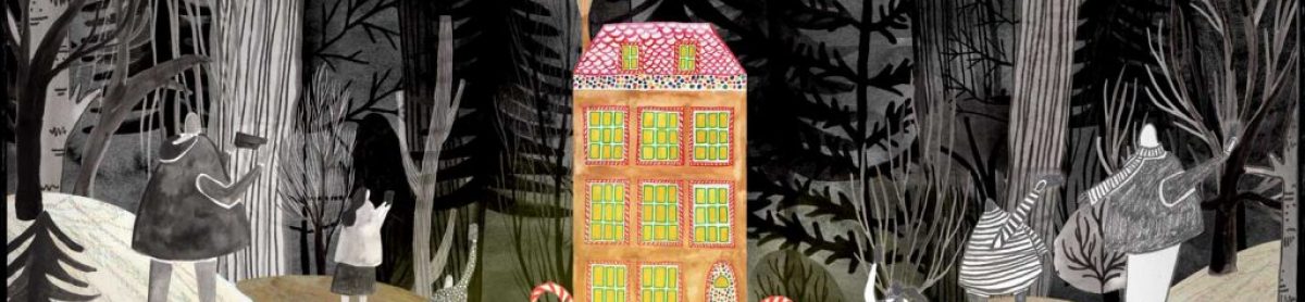
To start my work with Hansel and Gretel’s illustration I started by composing different potential scenes to try and visualise what worked and what didn’t.
The idea behind this fairytale is that Hansel posted a picture online of the gingerbread house which made it go viral and now there gatherings of people trying to take photos and selfies with the amazing gingerbread house as it is unlike anything else. And thus, the gingerbread house is spoilt by social media and the tons of people overcrowding it to get their perfect photo. It’s no hidden iced gem anymore!
I then started creating imagery like the candy and gingerbread house which would go in the illustration. I played with ink, collage, pen, watercolour and pencil to test different mediums and see which ones I wanted to use. I really like the idea of creating a mixed media piece with inks, paints, collage and pencil.
I illustrated the iconic gingerbread house – a small quaint cottage covered in candy, and I also tested creating a normal house like a town house or semi-detached house with the idea I would use the clipping mask on Photoshop to drop candy into the house. This would give a modern twist on an old fairytale and make it more my own.
Using ink, fine liner and pencil I started to draw and paint the people who would be present at the gingerbread house taking photos. They are all either taking selfies, group selfies, photos or couple photos with the gingerbread house.
I preferred the pencil people as they have more detail within them and I like the texture pencil creates.
As the gingerbread house is hidden away in a forest I started drawing trees from my local park to get an idea of what trees I would create within my forest. Using inks and fine liner I loosely painted a range of different trees which I intend on bringing into Photoshop and layer up together to create my forest background.
I created these four background tests to get an idea of what style and mediums I wanted to go for. I really liked the rolling hills getting smaller as they got further away and I also liked the use of different mediums – acrylic and pencil for the hills and ink for the trees. As well as this I enjoyed the path and the non-uniformed trees.
I recently went to the House of Illustration where I saw Quentin Blake’s exhibition on ‘The Tale of Kitty-In-Boots’. I was stunned and inspired by Blake’s use of watercolour and sketchy ink drawings. His drawings are scribbly and quick but his control is fantastic, he creates lovely characters and uses soft watercolour to make his drawings come to life. It was a real treat to see this original pieces first hand and get a chance to look close up to the watercolour pieces.
The exhibition of Quentin Blake’s original illustrations for The Tale of Kitty-in-Boots, were created for the recently re-discovered Beatrix Potter manuscript, published in September.
The book about ‘a well-behaved prime black Kitty cat, who leads rather a double life’, features classic Potter characters including Mrs Tiggy-Winkle and Mr Tod re-drawn by Blake.
The exhibition features Blake’s 50 illustrations for the book, a sketchbook and reference material. It also contains the original Beatrix Potter manuscript and one of Potter’s only two illustrations for the book, on loan from the V&A.
Below is the edited illustration which I created after my final tutorial feedback. I got rid of the door and the side room perspective as it didn’t add anything to the image and in fact just made it seem weaker.
I added in rain into the window background, a plant in the foreground, records and a record player on the floor, changed the rug, a different wooden floor and a framed picture. I also made the phone bigger so the viewer could see the tinder details more and added in motion detail to convey that Little red was swiping right on the wolf.
I’m much happier with this image, before it just wasn’t working for me and I couldn’t figure out why but with lots of Photoshop experimentation and playing I have come to a final illustration I am happy to present in the final crit.
Details:
Trying to gain insight into what medium I want to final use I did quick mock ups on Photoshop and played around with colour and composition. I think a very limited colour palette would work well for the final illustrations and depict a similar feel to old fairytale illustrations.
Below are some of the attempts I made:
Coloured background with black and white elements and Little Red in colour – all done in inks, wax crayon, watercolour and fine liner.
Similar to the previous attempt but with the elements coloured.
The elements in this one are created using wax crayon.
Fine liner black and white elements.
Fine liner elements coloured using block Photoshop colour.
Black and white blackground with only Little Red depicted in colour. This version is my favourite and I think it is the most successful. I want to have a fluid medium and style throughout the different fairytales so it is important I use a similar technique. I think I would like to take this image the stage further by bringing in textures and light.
Photoshop and colour attempt.
Black and white attempt using ink elements – too busy in my opinion.
To begin my project I decided to try my hardest to finalise the style and medium I was going to use for all my illustrations. Taking the first fairytale, Little Red, I started drawing up compositions, mock ups, testing with colour and drawing the different elements I wanted to use with different mediums.
To begin I quickly sketched different scenarios and perspectives to get an idea of what I was trying to achieve visually and see how it would work.
Little Red is iconically in a forest in the fairytale but as I’m making it modern and relating to Tinder, should it be somewhere else? Could I convey the idea of a forest in a different format? A bar or Little Red’s home perhaps with a forest wallpaper?
I then started character building with the wolf and Little Red, I didn’t want my characters to be too cartoony and I actually found I preferred them without a face. I played with different mediums like pencil, paint, ink and wax crayon to see what worked and I found my wax crayon wolves were the most successful and stylised.
I wanted the perspective of Little Red to be over her shoulder so the iPhone screen was visible to the viewer.
I tried different faces, styles of hair and a range of mediums to figure out which one my Little Red character would be.
Next I experimented with the idea of a forest – from using watercolours and creating a loose and abstract scene to drawing with detailed trees with pencil, I played with different effects and found inks, pencil and fine liner to be my favourite. I especially liked the black and white ones and thought maybe my illustrations would look good if they were all black and white except the main feature (Little Red).
Thinking of Little Red in her house (which is the place I found most fitting as people are most likely to be on Tinder at their homes when bored in the evening, maybe watching tv with a glass of wine etc). Therefore, I started to visualise the elements which would go into the house using inks and fine liner. I wasn’t sure what style I wanted to use yet so I tried multiple which I want to experiment with on Photoshop to see what works and what doesn’t once its put together.
I also illustrated a range of alcohol bottles and glasses with the idea I might create a bar scene. I really like these little illustrations and hope I can incorporate them in some way.
Finally, I created more forest trees with the idea I would bring them into Photoshop and play around with layering, sizing and colour. I want to create a forest wallpaper with these trees to represent the meaning of a forest but in a modern day setting.
I redrew the elements which would go into Little Red’s flat using inks and felt tip in colour so I have the ability to play around more with the use of colour on Photoshop, I might do my pieces mainly black and white but I am still unsure and plan on doing colour tests on all of my pieces to solve this query.
I also draw a new rug, plants to go in the foreground and a fireplace to test in the final illustration. I want the background to have lots of detail to entertain the eye and give the reader an insight into Little Red’s casual friday night.
I also drew fairylights, records, a record player, a painting in a frame, a new window and a wooden floor.
To finish, I drew two different chairs, a cabinet full of Little red’s belongings like DVD’s, books etc and I rew a liquor cabinet too. I didn’t use all these things in my final image but I tested them all out to see what did/didn’t work.
Johnny Broadley’s old fashioned illustrations depict pies, factories, ale, top hats and football matches, all from an era in Great Britain full of strange twists and turns. His funny-looking characters that range from Dickensian men to Bash Street Kids go about their daily business in reams of pretty hilarious comic strips.
His limited colour palette, quirky characters, way of incooperating text within illustrations and use of pattern is all of major interest to me for my project. So far on my project I have been trying to create a visual style and focusing on Little Red’s illustrations mainly with the idea that once I am happy with which style and medium I am going to do then I will move onto the other stories. However, I am worried there isn’t much time within this project at all so I need to hurry my work along and move onto the next fairytale if I’m going to succeed in doing six fairytales. I’ll start onto another fairytale today whilst experimenting with the style for Little Red as well.
So far I have painted all the elements I wanted to use in her story in inks and also done then in fine liners, I want to take all these elements into Photoshop and play around with colour and composition. However, now I’m thinking maybe the best way to pull these illustrations off is to create them all by hand and play with collage and different mediums more physically.
Looking into different imagery for inspiration, I was particularly interested in these Indian scarf designs. These traditional illustrations tell a narrative whilst having an interesting composition of blank space and intricate detail to create balanced and visually appealing pieces. This balance of pattern and space is something I must take into account within my own imagery, as well as finding a colour palette which works without containing too much colours or being too busy.